I work in international development so it comes naturally that a lot of projects I’ve worked on are in Africa. But whenever I chat with my friends and family, they fumble for words trying to find a nice way to ask me why I would ever want to travel to such a poor and dangerous place. Even more puzzling, the Vietnamese and American media seems to reinforce this perception. But little did they know…
Africa is larger than the US, Mexico, China, India, and Europe combined. The continent comprises of more than 60 sovereign states and territories with approximately 1.1 billion people! And just by looking at the picture below, would you be able to tell what you are seeing is Nairobi? The city looks more lively than Detroit at night, doesn’t it?

Given Africa’s geographic size, Anh and I are curious to have a quick glance at its economic landscape. So we compare GDP per capita of sub-Saharan African countries with that of Vietnam, hoping to calm my friends down a bit. Vietnam is the bold red line in the graph.
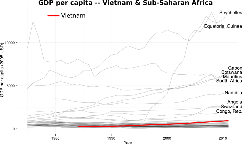
It appears that Vietnam is not much more developed, at least in terms of income, than the majority of African countries (told ya!). But the graph also shows a few shocking cases:
- Why are Seychelles so wealthy? Small island, lots of tourists.
- What’s up with Equatorial Guinea’s rise? Small island, huge recent discovery of oil. It is unfortunately a classic case of resource curse, with ordinary people suffering from poverty despite the misleadingly high GDP per capita.
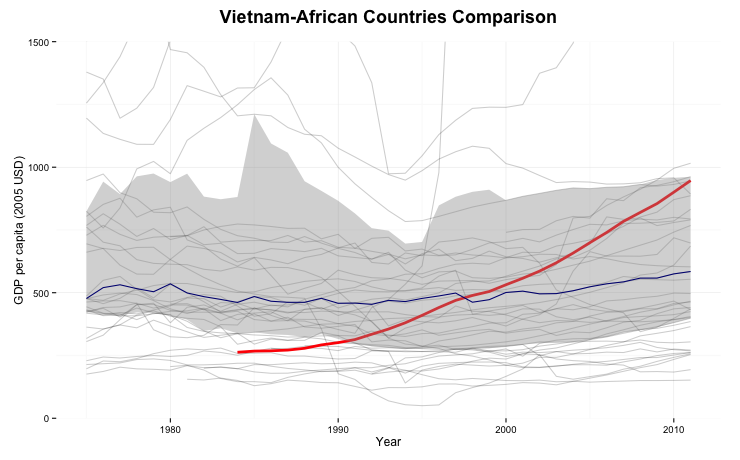
But including these cases in the graph is misleading so we remove the outliers and zoom in the region of interest. We also plot the median line in blue and the surrounding 50% confidence interval. It turns out that there has been only limited growth in Africa, whereas Vietnam has grown steadily since 1985, the start of its economic reform.
So friends, you can rest assured that I am travelling to a thriving and exciting place :) We’ll have a follow up on this topic in the next blog. In the mean time, please enjoy this video of MCA-Namibia’s Conservancy Development Support Services Activity – a community development initiative that I helped evaluate last summer.
How we plot the graphs: